Skip to main content
Design inspiration
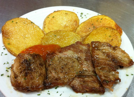
I have to admit to a guilty pleasure.As a former graphic designer I am a sucker for interesting and unusual packaging.My shopping basket is very often driven by design led packaging.If I find the wine label speaks to me, it might not necessarily be a good quality wine, but somehow its power of persuasion allows it to end up in my trolley.Can I resist that beatifully designed packaging on that tin of sardines? More often,not.
I do most of my "supermarket" shopping at Portugal´s biggest chain, Pingo Doce , and have always admired the design of their own label range of products.Their instore display and point of sale material is a hard act to follow when you visit other Portuguese supermarkets.The quality of photography and styling on the packaging is in a league of its own.
 Hmm-surprise surprise,why am I such a fan? On further investigation the responsibility for this design commission rested with London based brand strategists, Nucleus.
Pingo Doce occupies a special place in the hearts of Portuguese
consumers. As the leading supermarket group in a country of food lovers,
Nucleus were briefed to refresh the brand identity and then transform every
own-brand product in a complex and intensive programme of work that
lasted many years. Their brief was to apply UK-standards of design, but
with a distinctive Portuguese flavour.During the programme their Lisbon office project managed the projects and
provided local insights, while their design team in London were the overseers of
design and production.
The work embraced all aspects of the business and
included launching the concept of own-label wines (a first for
Portugal), bringing to the fore, the individuals behind some of
Portugal’s finest wines – a concept Nucleus had introduced years earlier for
both Oddbins and Bottoms Up in the UK.
Hmm-surprise surprise,why am I such a fan? On further investigation the responsibility for this design commission rested with London based brand strategists, Nucleus.
Pingo Doce occupies a special place in the hearts of Portuguese
consumers. As the leading supermarket group in a country of food lovers,
Nucleus were briefed to refresh the brand identity and then transform every
own-brand product in a complex and intensive programme of work that
lasted many years. Their brief was to apply UK-standards of design, but
with a distinctive Portuguese flavour.During the programme their Lisbon office project managed the projects and
provided local insights, while their design team in London were the overseers of
design and production.
The work embraced all aspects of the business and
included launching the concept of own-label wines (a first for
Portugal), bringing to the fore, the individuals behind some of
Portugal’s finest wines – a concept Nucleus had introduced years earlier for
both Oddbins and Bottoms Up in the UK.


 Hmm-surprise surprise,why am I such a fan? On further investigation the responsibility for this design commission rested with London based brand strategists, Nucleus.

Comments
Post a Comment